Student-first access
Students can open updates, services, and campus information without moving through a complicated journey.
 NextCode®
Launch Story
This concept turns the gallery visual into a complete landing-page moment with product copy, mobile previews, and clear launch messaging.

Overview
A bold introduction that frames the product before the user scrolls.
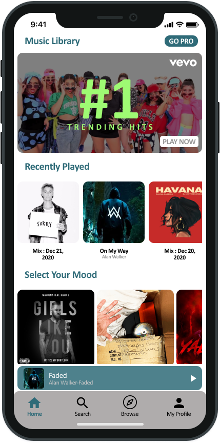
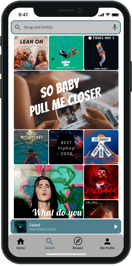
Phone screenshots sit directly under the hero so visitors can inspect the experience.
Short, direct messaging keeps the page easy to edit later.
Benefits
Everything below is built to make a strong first impression and get out of the way once the real content is ready.
The same layout scales from a single screenshot to a full multi-device showcase without breaking.
Pre-built sections mean less time designing and more time shipping the actual page.
Every section is CMS-friendly, so copy and images can be updated without touching code.
University platform
A student-first digital platform for UPTM, covering admissions, campus information, announcements, and mobile access in one connected experience.
Students can open updates, services, and campus information without moving through a complicated journey.
Public pages can present programmes, intake details, and enquiry points for new students.
Platform showcase
Switch between the student app and the admissions website story. Each side uses its own copy so the future CMS can manage them separately.
Student App
A phone-first student journey for announcements, service shortcuts, profile access, and daily university updates.
● Student portal live
Website
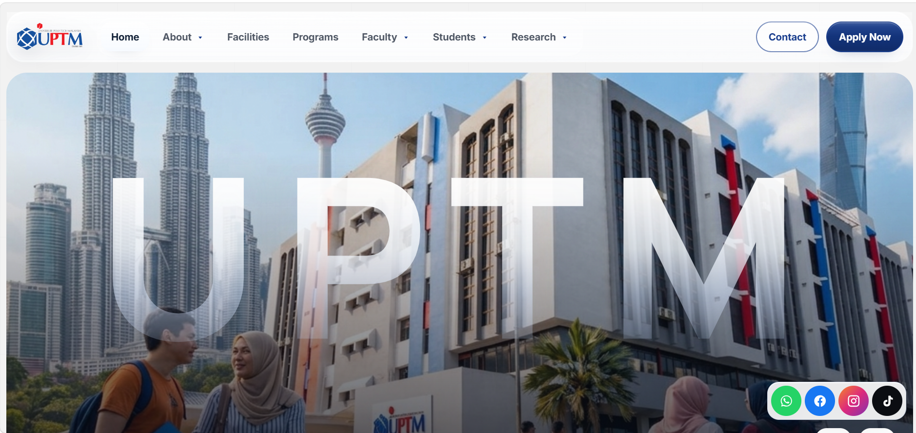
A public-facing admissions path for programmes, intake campaigns, enquiry actions, and UPTM brand confidence.
● Admissions ready
Clickable tablet preview
Use this tablet frame for the future UPTM website or iPad preview. The whole image is clickable, so you can point it to an admissions page, live project, or CMS-managed URL later.
Delivery campaign
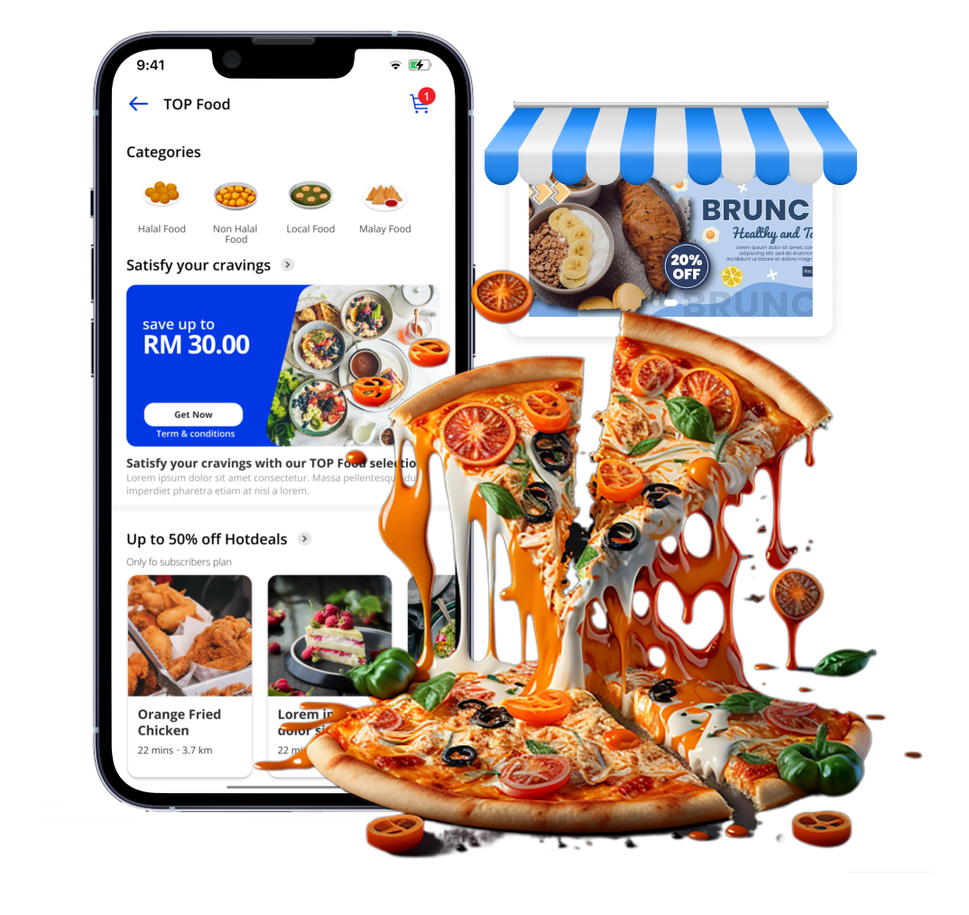
Give the campaign a finished product story with a bright app visual, concise selling copy, and reusable content blocks for future launches.
Food, grocery, and essentials browsing in one mobile-first storefront.
Promo banners and offer cards can be replaced for each new campaign.
A clear CTA path keeps visitors moving from interest to signup or quote.
Next project
Himalayan peaks above the clouds